UX/UI Product Design · 2022-2024
Customer Onboarding Journey
Redesigning Outfund's funding application so SMEs applying for revenue based finance get a faster, clearer, more self serve onboarding experience.
Overview
Outfund is a revenue based finance company providing non dilutive capital to e-commerce and SaaS businesses. This project focused on simplifying the customer onboarding journey, taking friction out of the flow, building more trust along the way, and getting more applications across the line.
The problem
Customers were struggling to complete the application on their own. The journey was unclear, multi step, and leaned heavily on sales support, which led to a high drop off rate and capped revenue.
71%
Drop off rate in the original application journey
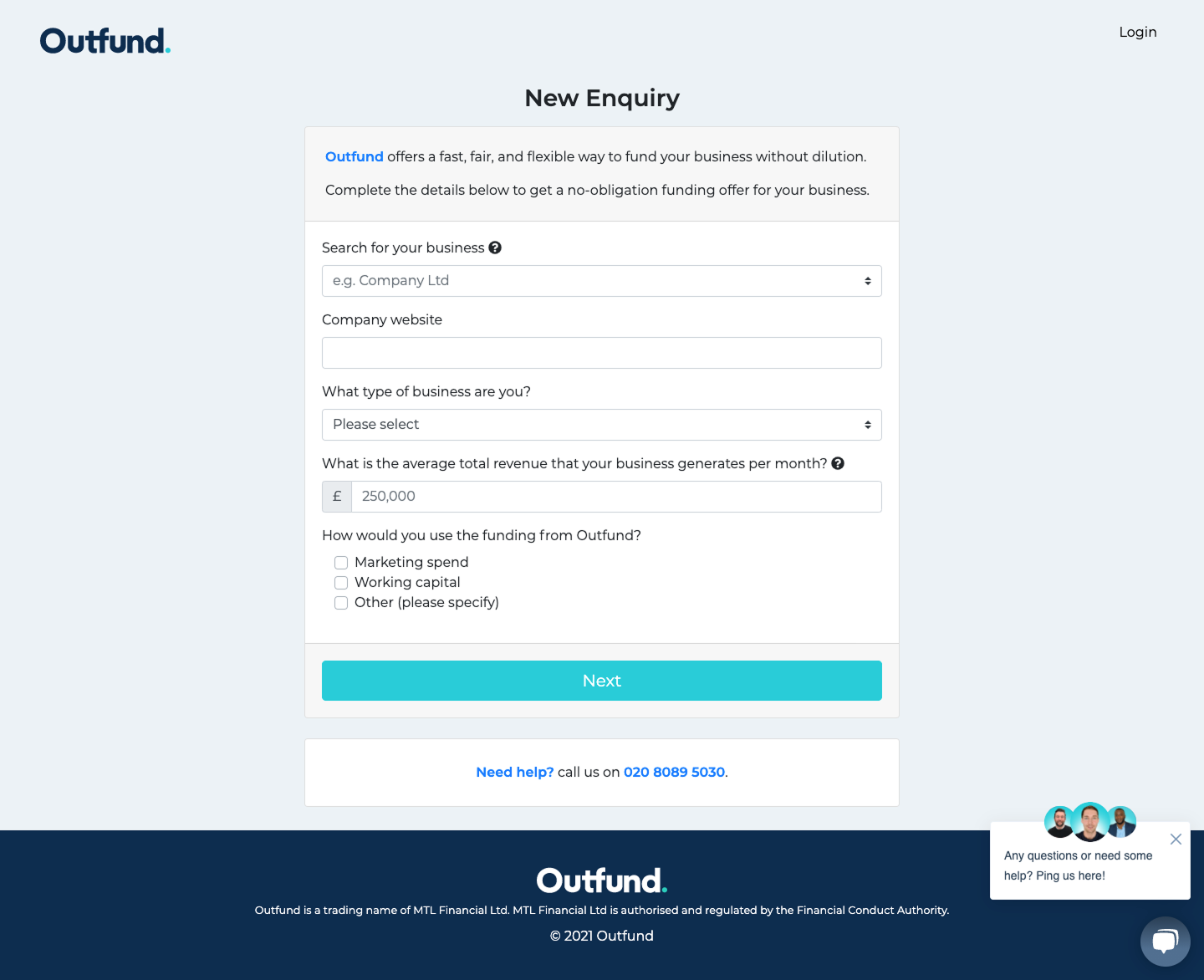
Before
The journey we inherited.
Taking a look at the current application journey, there was a massive multistep form that was unclear and relied heavily on the sales team to guide the user through to the end of the process. Visually there was no clear message or instructions on how to proceed, leaving the user with pain points and, as a result, not finishing the application.
Customers struggled to complete and submit the application independently, leading to a 71% drop off rate and a decline in revenues, with a heavy dependence on sales staff to drive growth.
71%
Drop off rate on the original application, surfaced by the Head of BI
My role
I worked closely with the product lead and another product designer across the full end to end design process, including:
- Customer and competitor research
- Service blueprinting
- Wireframing
- Prototyping
- Usability testing
- Stakeholder collaboration
- Handoff and implementation support
Research & discovery
Workshops, brainstorming sessions and stakeholder collaboration helped us surface operational constraints and business goals, while competitor research and customer insights revealed the real pain points behind the drop off.
Ideation & design process
We redesigned the customer journey from the ground up and broke the application into clearer sections. I owned:
Company details pages
Repayments page
Verification process
Onboarding flow
The work moved from sketches into low fidelity wireframes, then high fidelity Figma prototypes, then through internal usability testing and a couple of rounds of guerrilla testing.
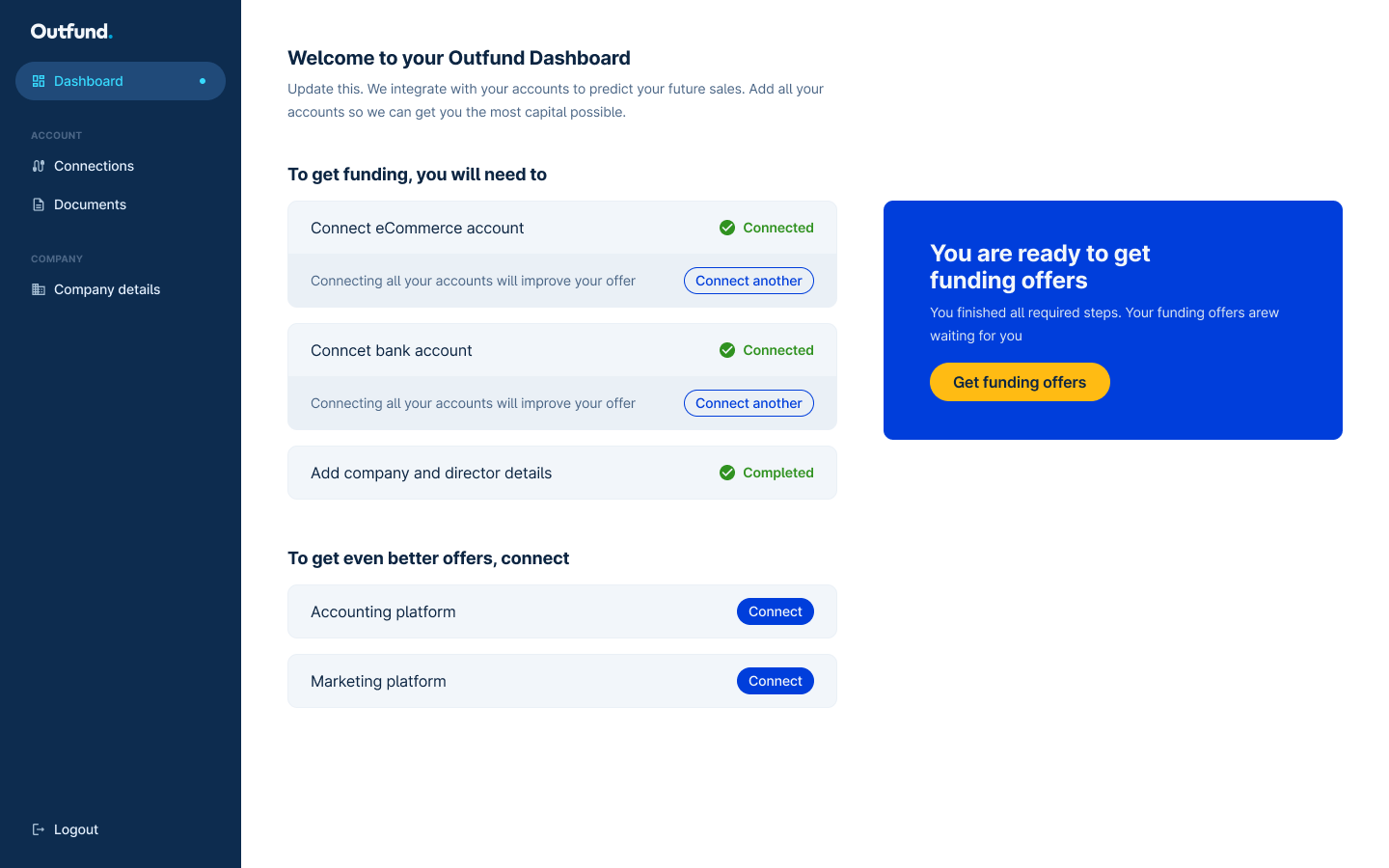
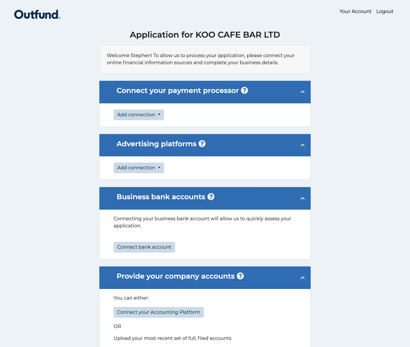
Solution
A clearer, more intuitive, self serve onboarding journey, with trust building moments built in throughout:
- Clearer instructions
- Improved information hierarchy
- FAQ content
- Option to speak with sales support
- Case studies and testimonials
- Stronger company information to build credibility
Results & impact
−96%
Submission time reduced from several hours to around 4 minutes
−83%
Decrease in Customer Acquisition Cost within six months
2.3x
Margin uplift by reducing dependency on the sales team
Challenges & learnings
The hardest part wasn't the interface. It was balancing user needs against internal operations, technical constraints, stakeholder requirements and the trust expectations of a regulated financial product. Designing for self serve in lending means every clarity gain has to be weighed against risk, compliance and commercial reality.
Outcome
A redesigned, self serve onboarding journey that cut submission time by 96%, lowered CAC by 83% in six months, and lifted margins 2.3x by taking pressure off the sales team.
Worked with
Next case study
Pension Find & SIPP Journey
Just Group →