UX Strategy · Mobile Product Design · 2025
Pension Find & SIPP Journey
A trusted pension discovery experience inside a regulated mobile app, helping people locate old pensions and finally see their retirement finances in one place.
Overview
I joined the Financial Products squad at Just Group to design a new pension find and consolidation experience inside the mobile app. The long-term vision was simple: help people locate their existing pensions and, eventually, bring them together into a SIPP product without ever leaving the app. The harder part was doing that inside a heavily regulated environment, where trust, accessibility and clarity matter as much as the flow itself, especially for people sharing sensitive financial information for the first time. Technical limits with our original provider and shifting business priorities pushed us into a phased approach. We launched a standalone Pension Find tool first, introduced a new Money section in the app, and planned to layer consolidation and SIPP on top later. The project paused two weeks before release due to acquisition activity, but the work was ready to ship.
The problem
The business wanted to give people a simpler, more accessible view of their retirement finances. A lot of customers had small pension pots scattered across providers and very little sense of where their money actually was. On top of that, the original pension provider integration was slowing delivery, the journey needed iDV and KYC built in, and people were being asked to share sensitive financial information inside the app for the first time. So the experience had to feel genuinely trustworthy while staying simple, with vulnerable customer needs and accessibility considered the whole way through. It wasn't really a feature add. It was about designing confidence into every step.
2 weeks
From release when the project paused due to acquisition
My role
As the UX Designer in the Financial Products squad, I worked closely with product managers, developers, compliance, legal, stakeholders and external providers across the full end to end design process, including:
- UX strategy
- Journey mapping
- Wireframing
- Prototyping
- Stakeholder workshops
- User testing
- UI refinement
- Developer collaboration
- Implementation support
Research & discovery
Because this was such a sensitive financial journey, research and trust building were at the centre of the work. I worked closely with compliance and legal to make sure the experience met regulatory requirements without losing its warmth. One question shaped most of the discovery: how do we make people feel safe enough to share sensitive financial information inside the app? From there, research focused on onboarding friction, trust signals, accessibility, vulnerable customer journeys, information hierarchy, reassurance messaging and progressive disclosure. We also looked hard at the limits of the original provider integration, which led to the call to split pension find off from the later consolidation and SIPP work so we could move faster.
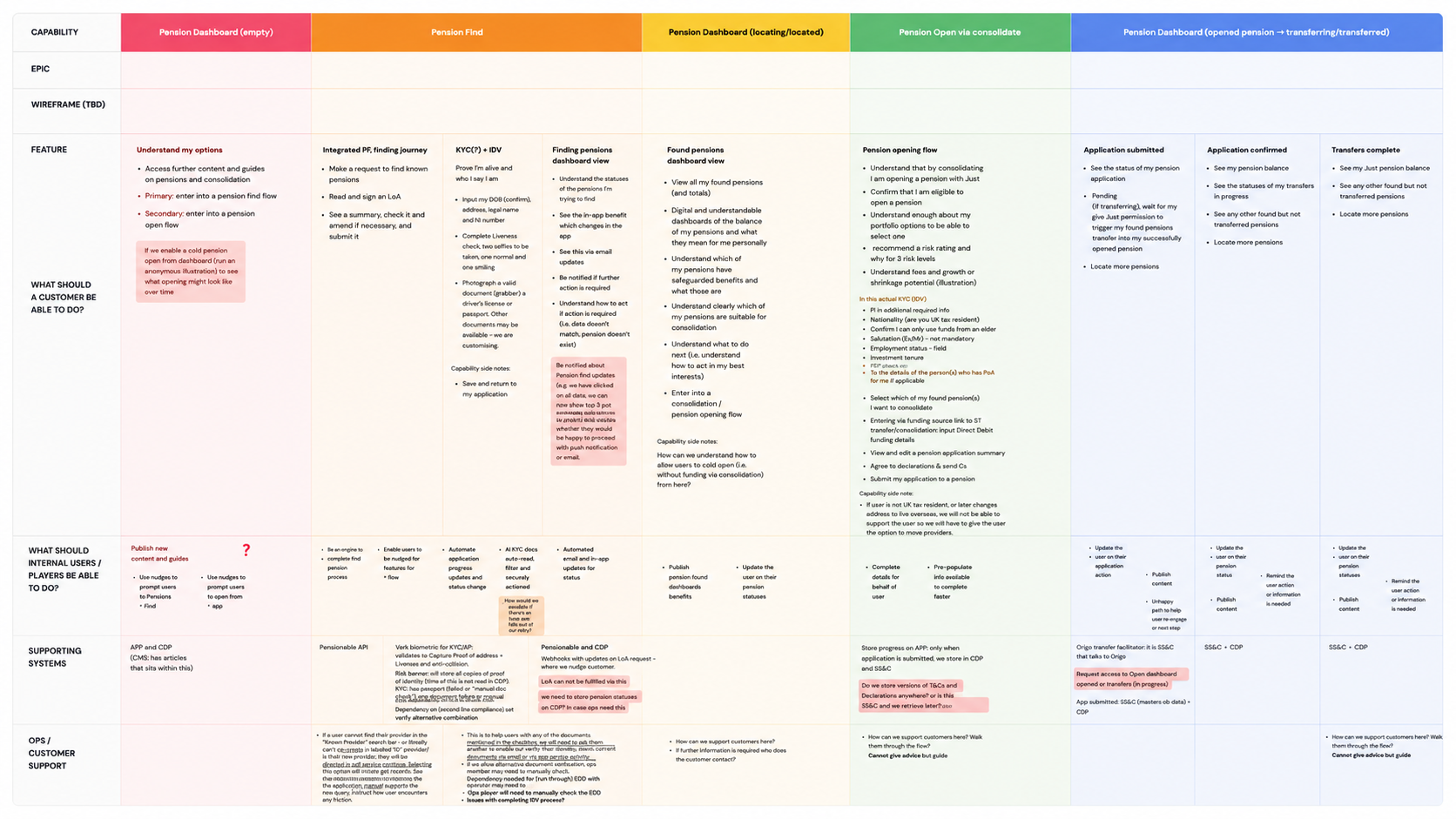
Discovery blueprint
Mapping the pension find & consolidation journey.
Built off the back of a six week discovery with third-party providers and internal subject matter experts. We walked through each capability together — looking at systems, internal users, vulnerable customers and the supporting ops — and translated it into user stories that fed straight into ideation and wireframing.
Ideation & design process
The work evolved a lot as priorities and technical realities shifted. We started by exploring a combined find and consolidation flow, then reshaped it into a phased approach that was simpler and more feasible. Areas I owned included:
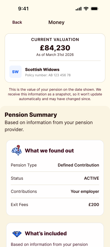
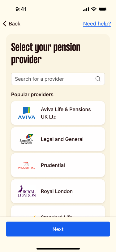
Pension search flows
Onboarding and consent screens
iDV and KYC journeys
Trust building UI patterns
Mobile information architecture
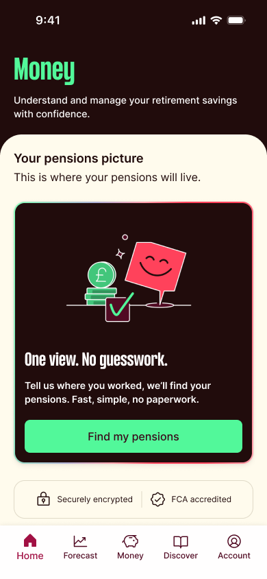
The new Money app section
Error handling and guidance states
The work moved from low fidelity journey mapping into interactive Figma prototypes, through moderated usability testing, and into iterative refinement with developers and stakeholders. As a mobile first experience involving sensitive financial actions, a lot of attention went into reducing cognitive load and making each step feel clear, calm and reassuring.
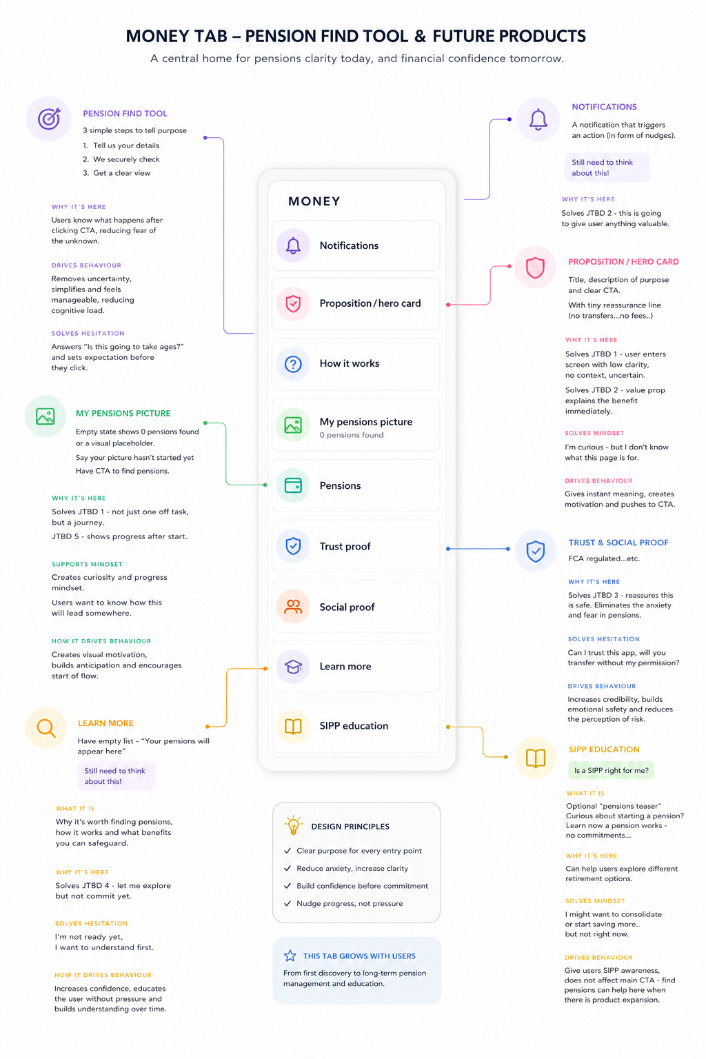
Wireframe
Designing the Money tab.
Once the Pension Find tool was designed, we wireframed a new Money tab as the home it would live in, alongside any future financial products. Mapping every entry point, why it earned a place on the screen and how it nudged behaviour gave us a clear foundation for the first iteration.
Solution
The final design was a simplified pension discovery experience inside a dedicated Money section of the mobile app. It helps people locate existing pensions quickly, builds confidence through clear communication, takes friction out of regulated onboarding, and gives the team a foundation to add SIPP and consolidation later.
- Simplified step by step flows
- Clear consent and verification messaging
- Supportive microcopy
- Strong visual hierarchy
- Transparent explanations around data usage
- Accessible interaction patterns
- Reassurance throughout iDV and KYC stages
Interactive prototype
Try the flow yourself.
Explore the pension discovery flow prototype directly in the portfolio. Tap through the screens just as a user would on their phone.
Loading prototype
Tap or click hotspots to navigate the flow
Results & impact
100%
Task completion rate across moderated usability testing (8/8 participants)
<4 min
Average time to complete the full pension find journey
0
Critical usability issues; users navigated iDV and KYC without support
Challenges & learnings
This project reminded me how much trust, clarity and collaboration shape good fintech product design. The UX was deeply influenced by compliance, legal, technical providers, operations and vulnerable customer needs, and designing inside regulated financial services means constantly balancing user confidence, accessibility, business goals, delivery and feasibility. Even though the project paused before launch, it's one of the most strategically complex and collaborative things I've worked on, and it strengthened my belief in designing thoughtful financial products that help people feel more in control of their future.
Outcome
A calmer, more intuitive financial experience that balanced regulatory complexity with what people actually needed. Testing showed people understood the purpose of the journey, felt comfortable sharing sensitive financial information, and could complete fairly complex pension tasks on their own. The phased product strategy also got us closer to release by separating pension discovery from the more technically complex SIPP work.
Worked with
Next case study
Broker Platform
Outfund →